Overview
The Pasta Haters (TPH) is a multi-user e-commerce platform based in Sweden where consumers can shop for vintage clothes and products from established retailers.
Time Frame: 3 days Team: Lisa Gautier, founder
My Main Role: UX/UI Designer
My Additional Role: Content Writer
Tools: paper, pen, Sketch
Problem
I met with the founder of TPH to determine her brand's needs; the landing page needed to reflect the quality of a higher fashion e-commerce platform instead of a product search page.
Solution
Process
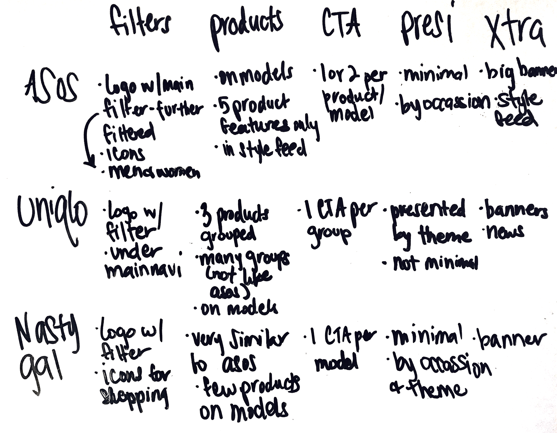
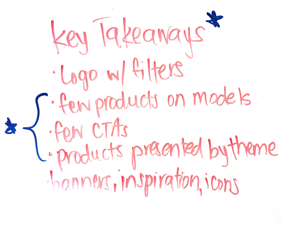
Competitive Analysis: I analyzed the landing pages of TPH's competitors like ASOS, UNIQLO and Nasty Gal to find out what TPH needed to reflect higher quality fashion. I then met with the founder to present the key take aways.


ideation: in a previous project, the TPH retailer dashboard, I realized that many of TPH's retailers have established businesses with loyal customers. So, I added a new key feature to the landing page; a section that would make this partnership transparent to new consumers and easily accessible to loyal customers.
Sketches: How can I visually manifest my research and ideas on TPH's landing page? I roughly sketched wireframes influenced by the competitive analysis and ideation phase.
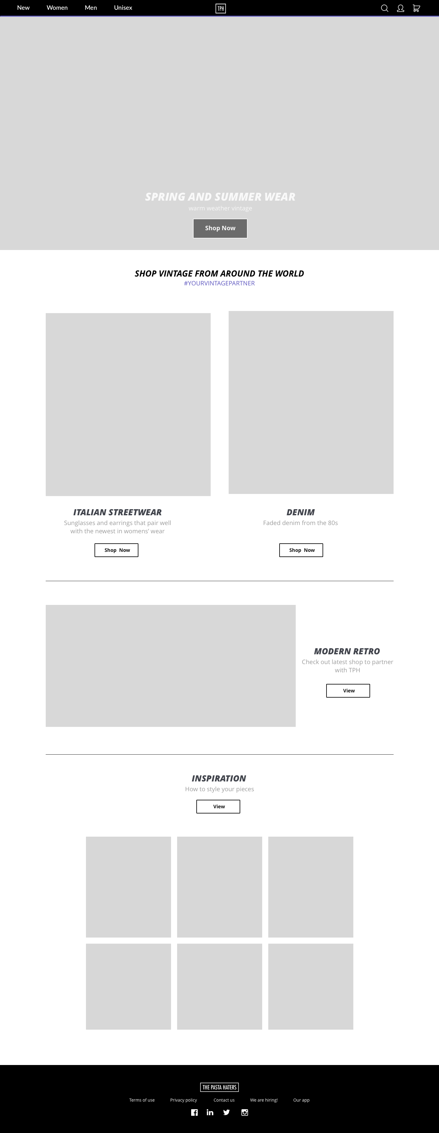
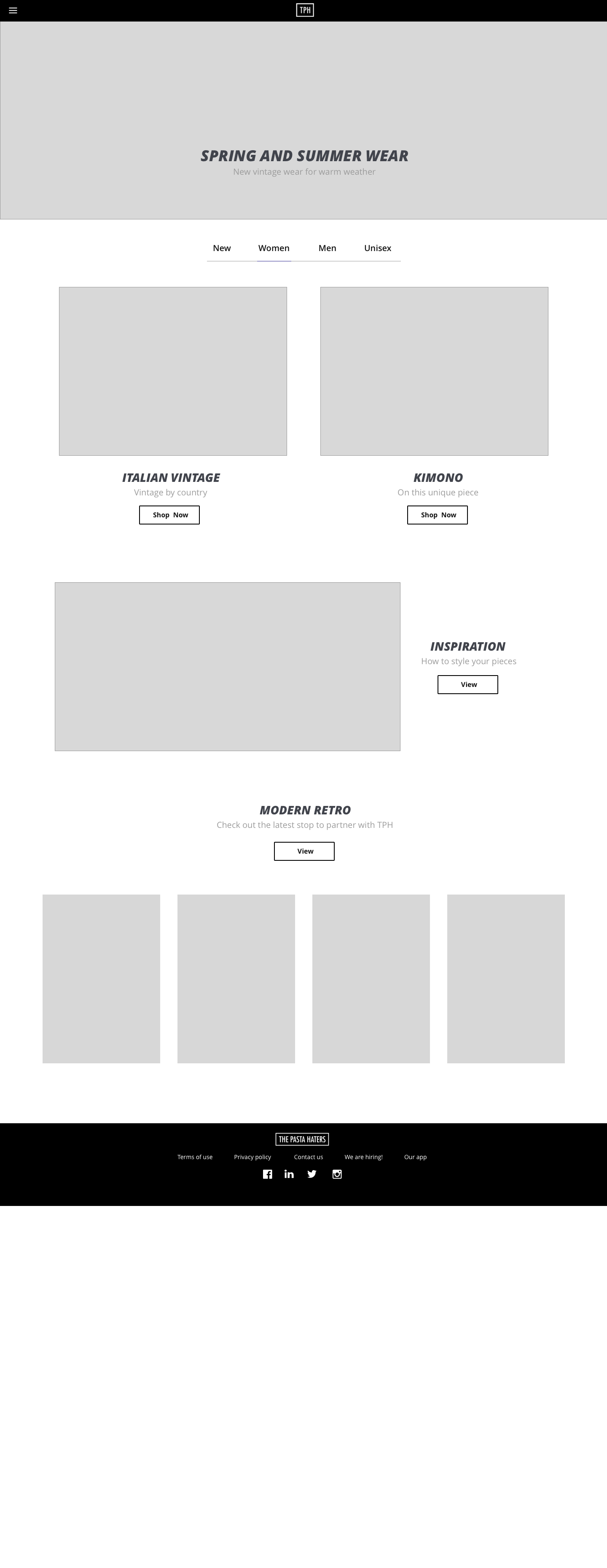
Wireframes: I decided which sketchy contender would be the winner by developing them on Sketch. The left was chosen!


Learnings
• Competitive analysis helped identify patterns in the fashion e-commerce industry and set goals for TPH's platform.
• Understanding one user can help ideate for another; previous user testing for The Retailer Dashboard helped ideate for the consumer user.