Overview
Human Interest (HI) is a 401(k) plan provider for small businesses, startups and their employees. HI has two products: an admin facing platform for the employers and a participant facing platform for the employees. I led the participant onboarding and platform redesign.
Time Frame: 3 months
Team: 1 Product Manager, 1 Visual Designer, 1 User Researcher, 6 Engineers
My Main Role: Product Designer Tools: Mural, Figma, Zoom
Business Goal
Within the 401(k) space, most of the impact opportunity exists during onboarding. People don't often return to their dashboard.
Nevertheless, a platform redesign was needed to align with the new onboarding experience and prevent a jarring, inconsistent user experience.
Problem
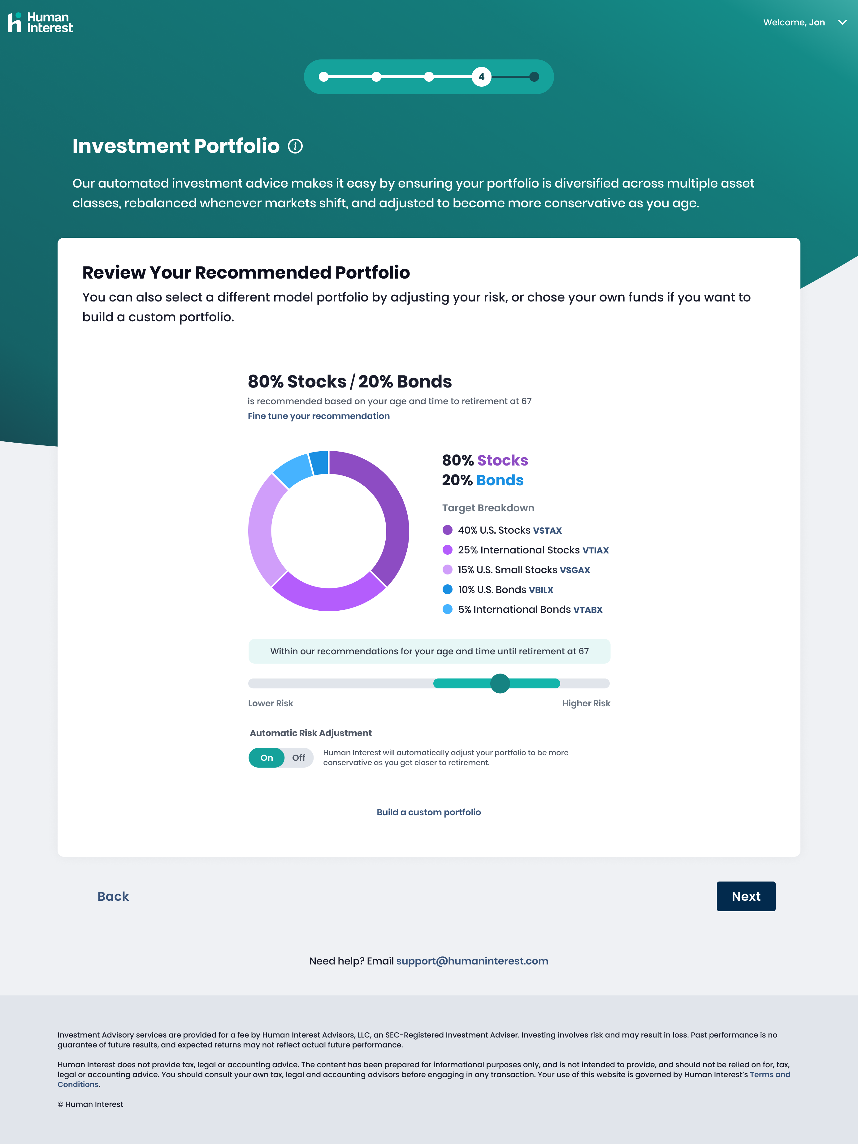
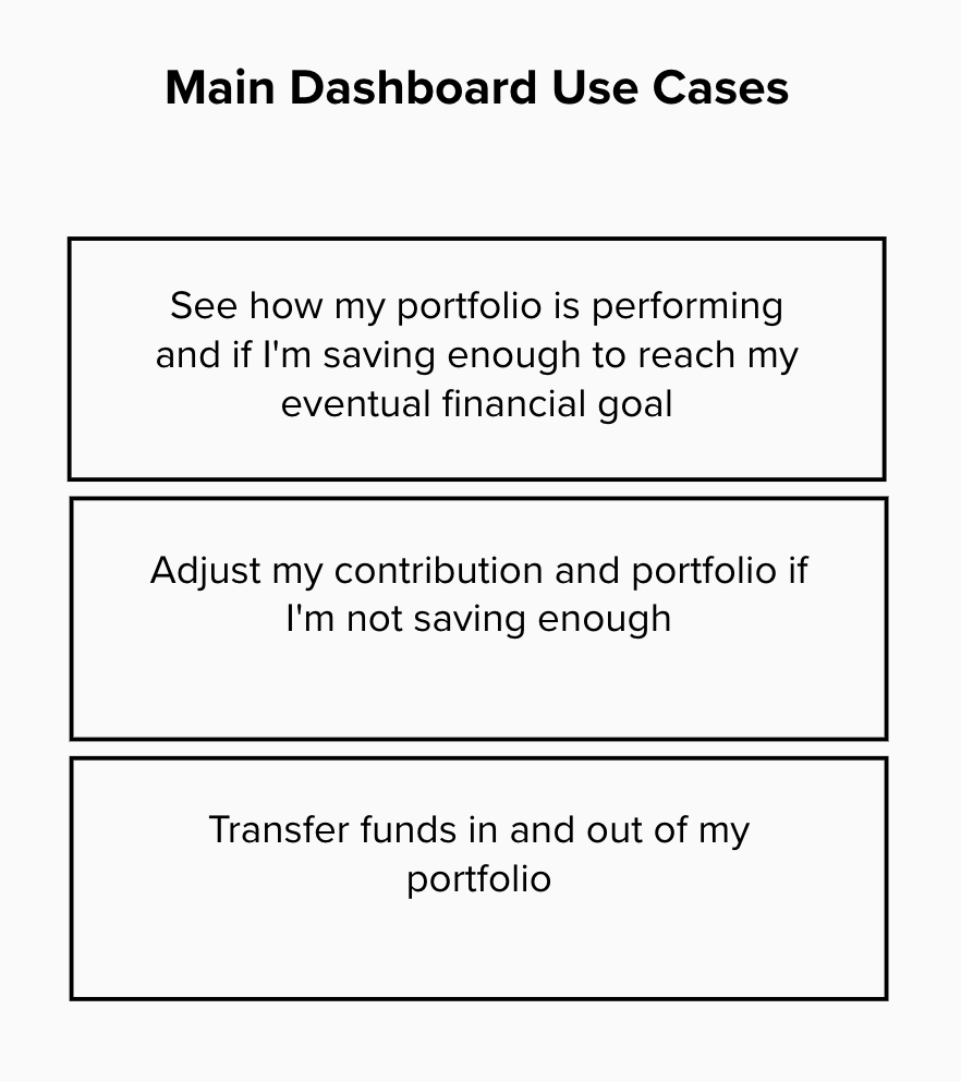
Employees have a hard time finding relevant performance and contribution information in our product. how might we help them find their 401(k) performance and adjust their contribution if needed?
Solution
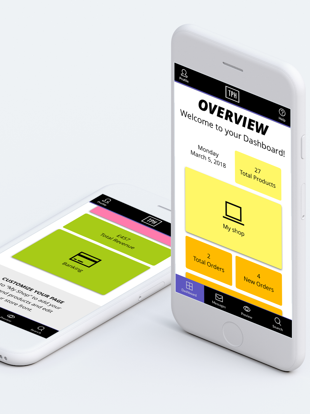
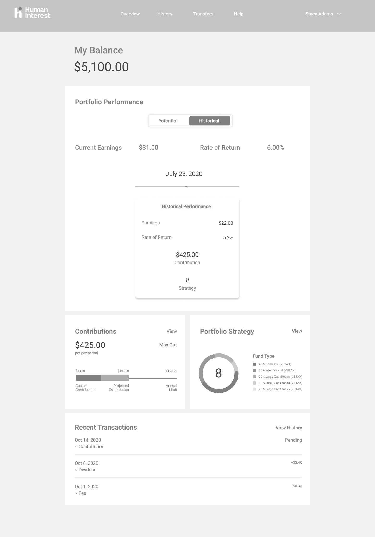
An update to the platform's information architecture and dashboard redesign to preview information and then take action on it.
Process
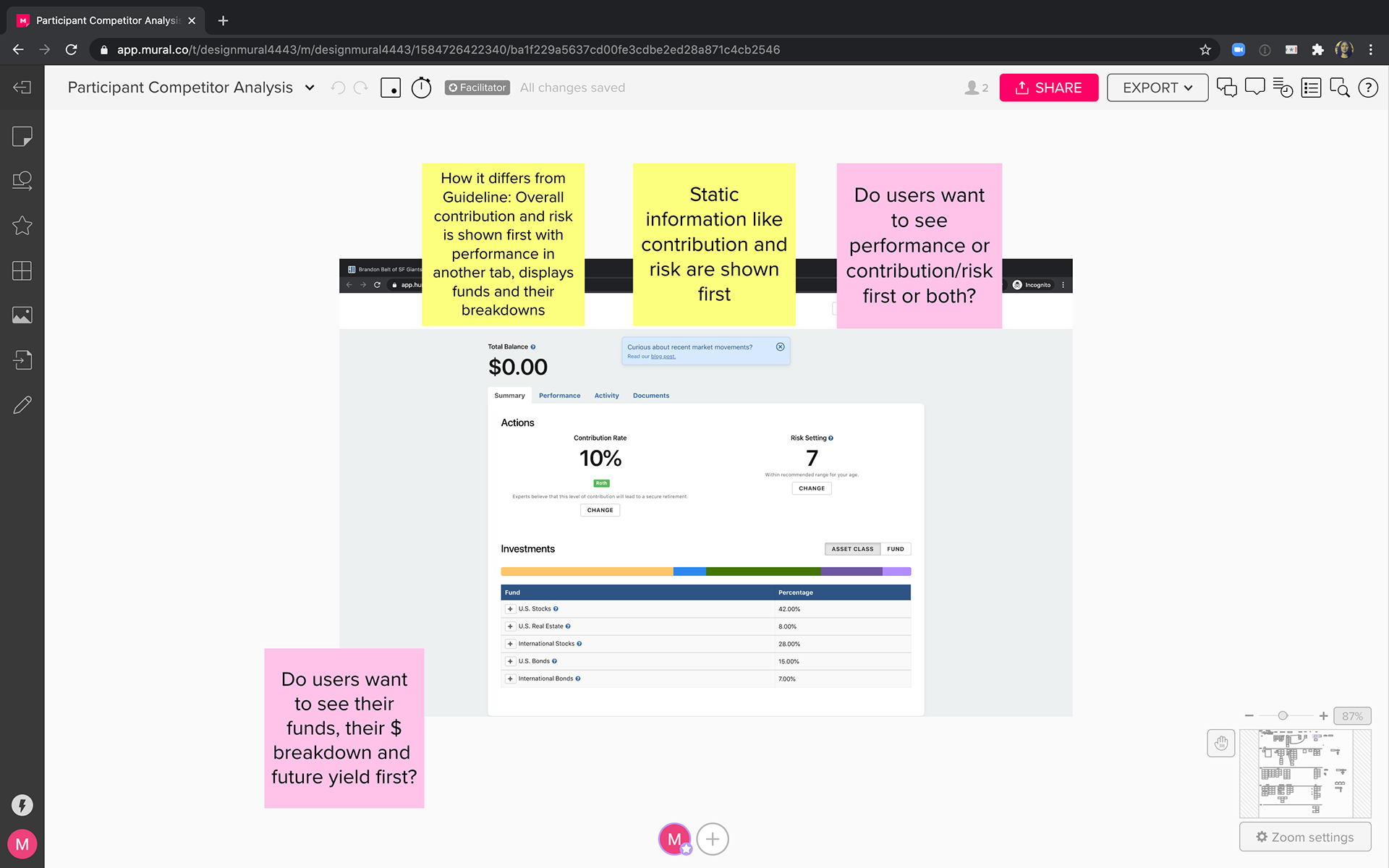
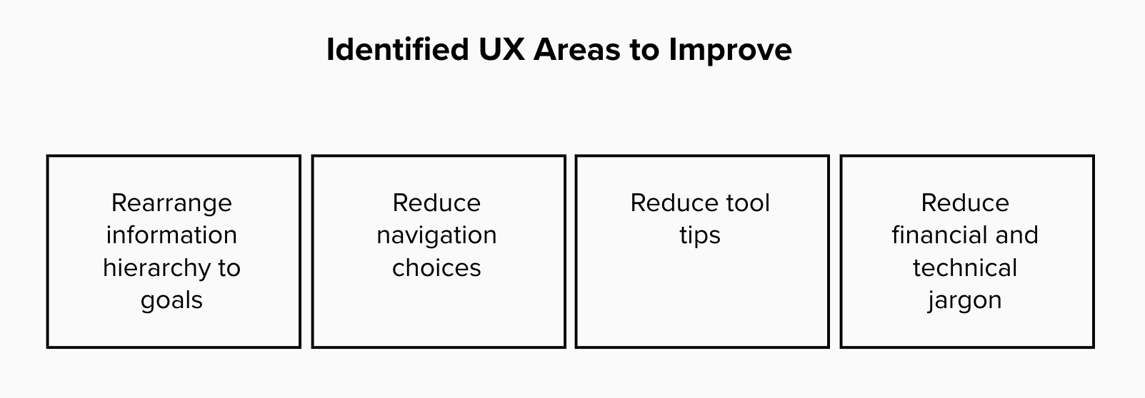
UX notes: As a participant in HI's 401(k) plan, I noted areas of ux improvement throughout the product. I shared my notes with the product and design manager and together we decided on the top areas we wanted to improve in this dashboard redesign.
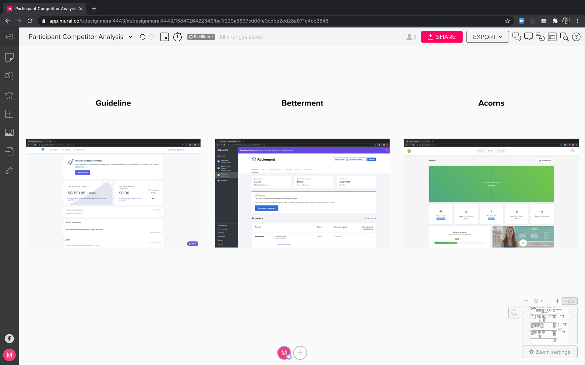
Competitive Analysis: A competitive analysis helped me understand what user needs our competitors believe exist in the retirement space and how they address those needs in their navigation and platform information architecture.
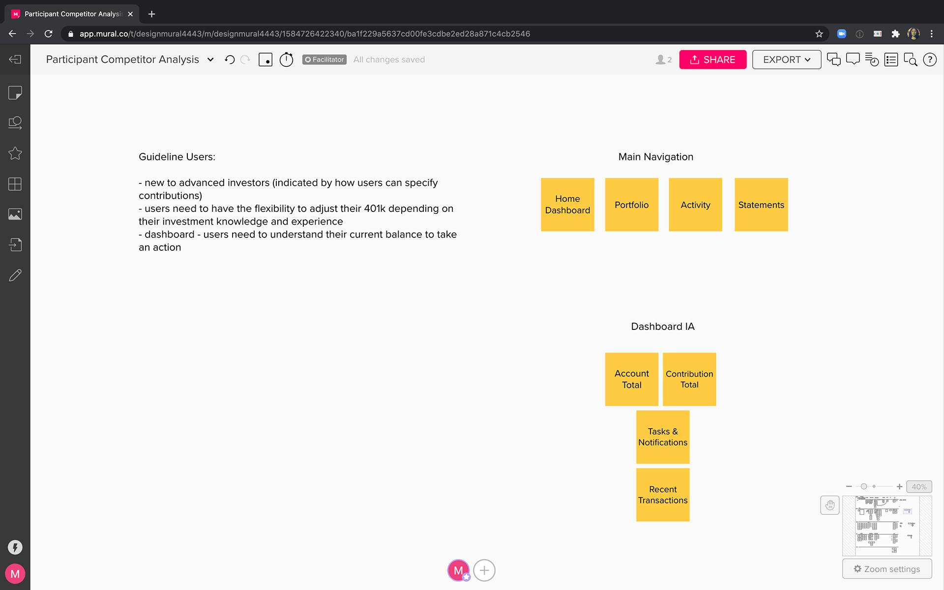
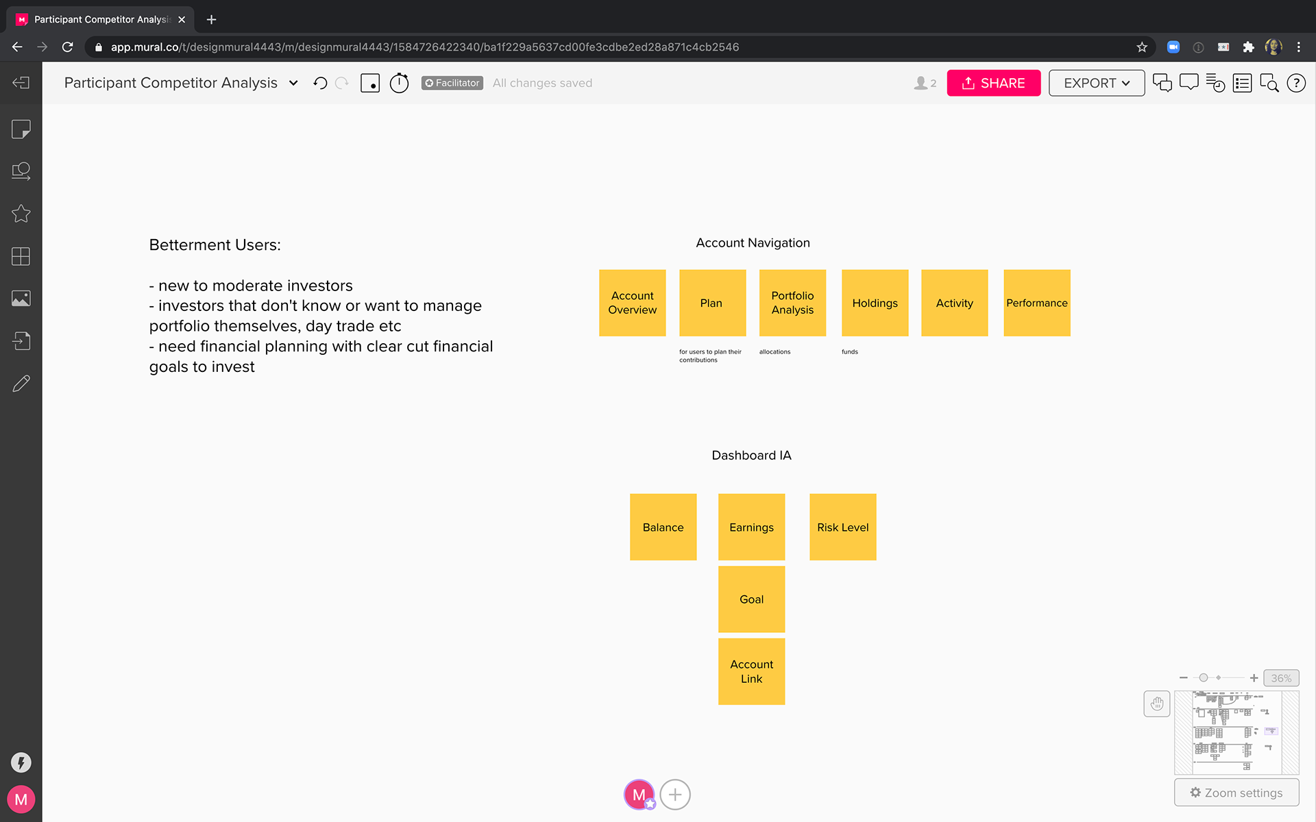
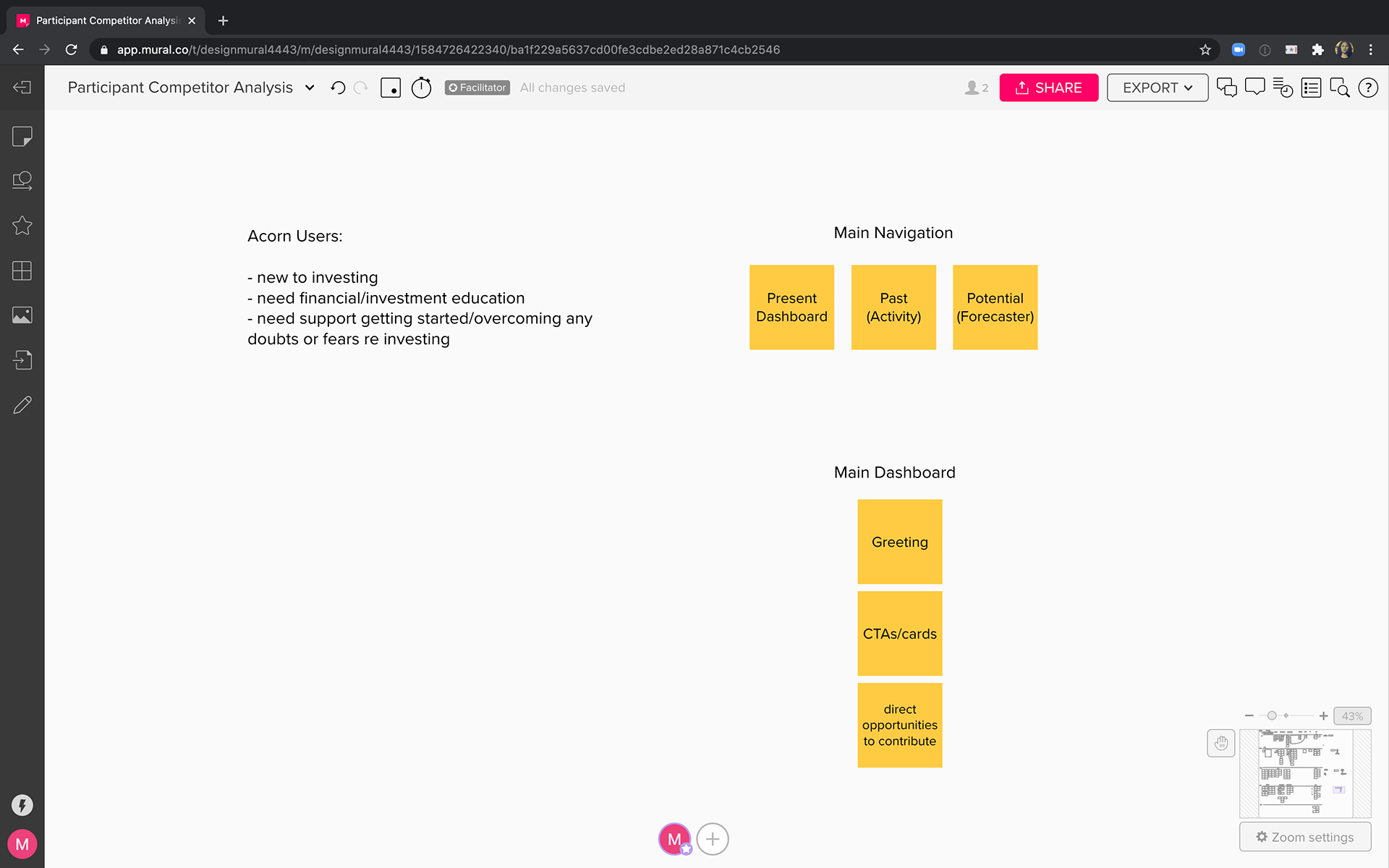
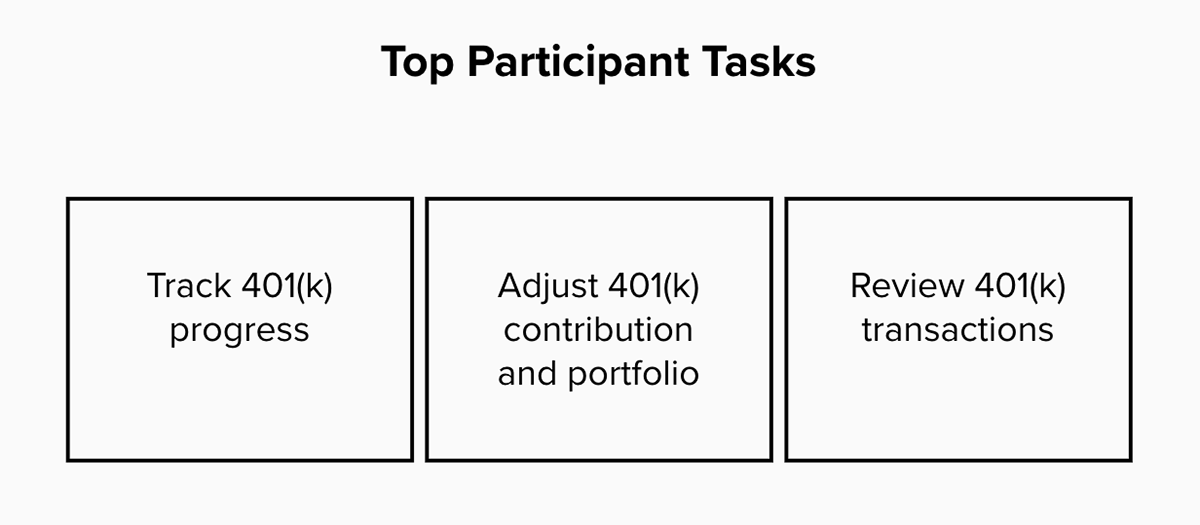
Assumptions: Based on the competitive analysis, I listed the top user needs, use cases and tasks to form a hypothesis.
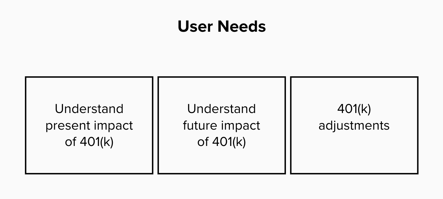
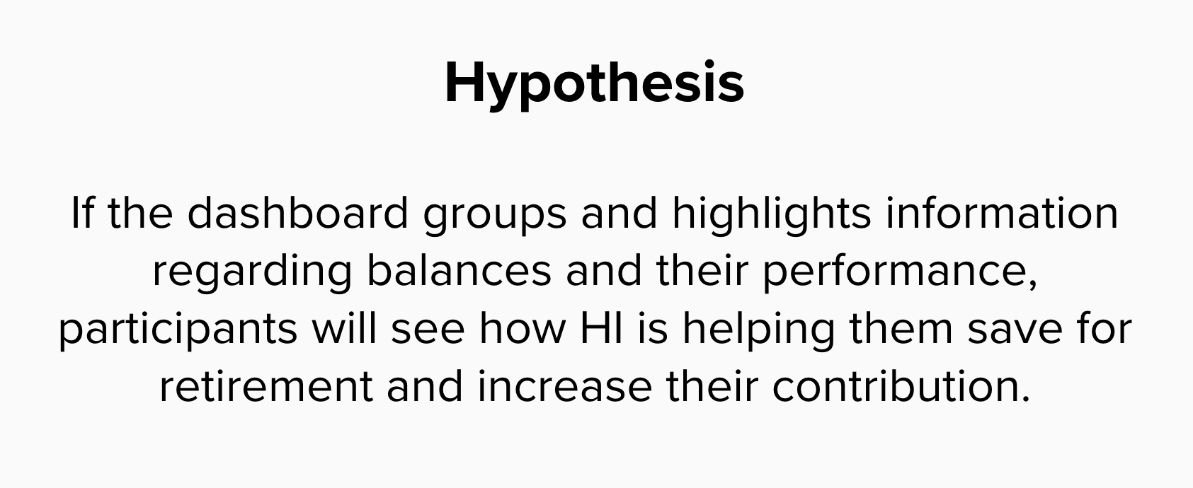
Hypothesis: I formed a hypothesis that included HI's business goal to increase participant contribution and this helped guide the platform's information architecture.
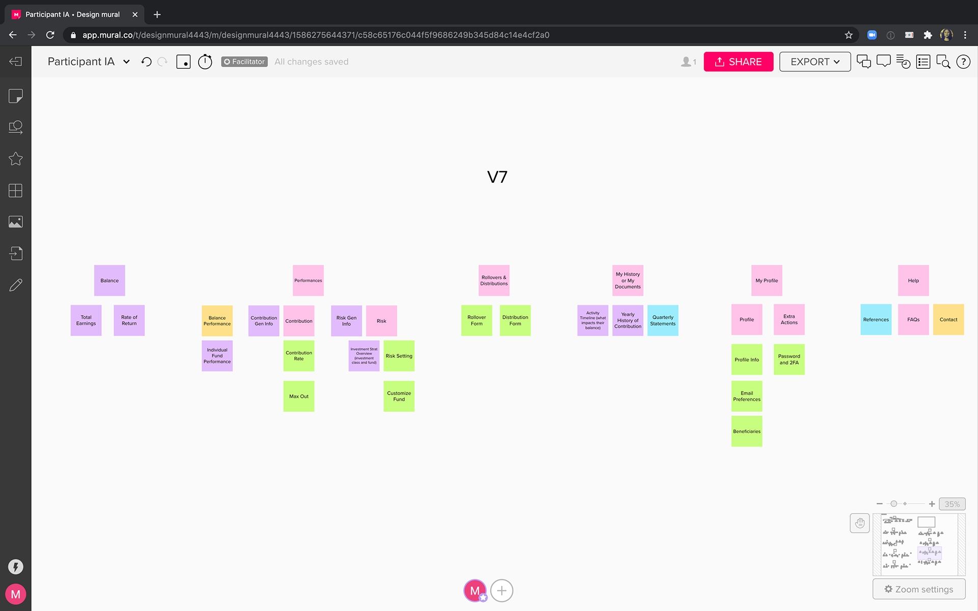
Information Architecture: I explored different arrangements of the navigation to hone in on the existing content that should exist on the platform. Afterwards, I explored the dashboard's information architecture.

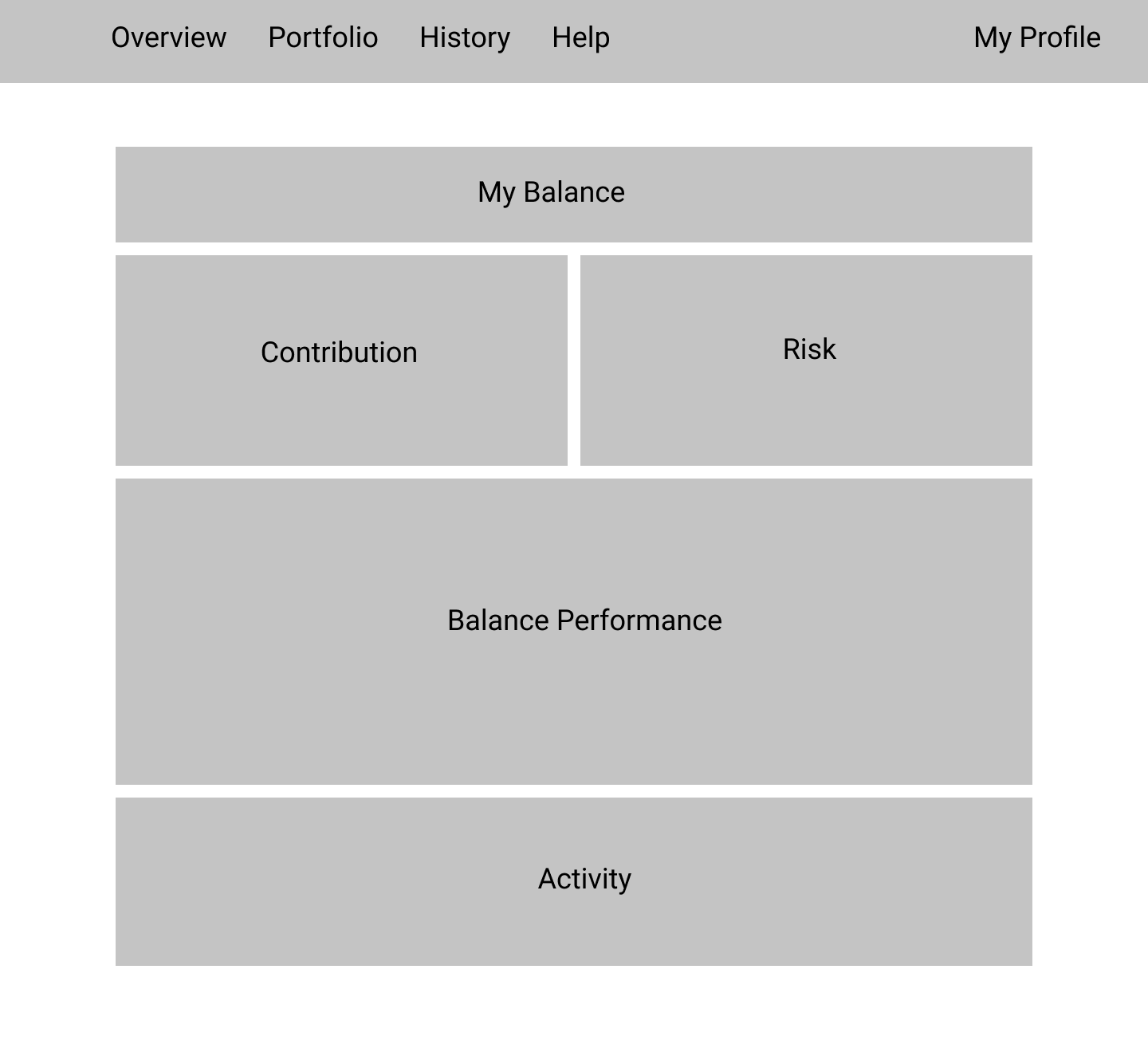
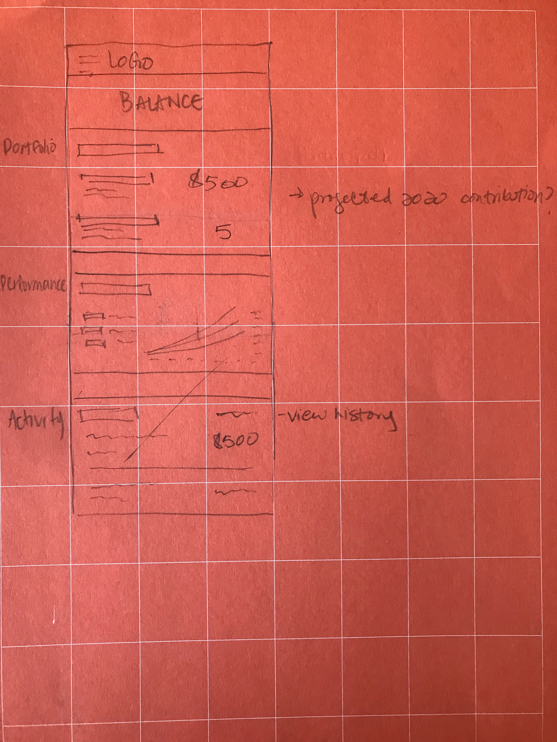
low-fi sketches: Sketching helped me understand what the IA could look like as actual features in a mobile and web layout.
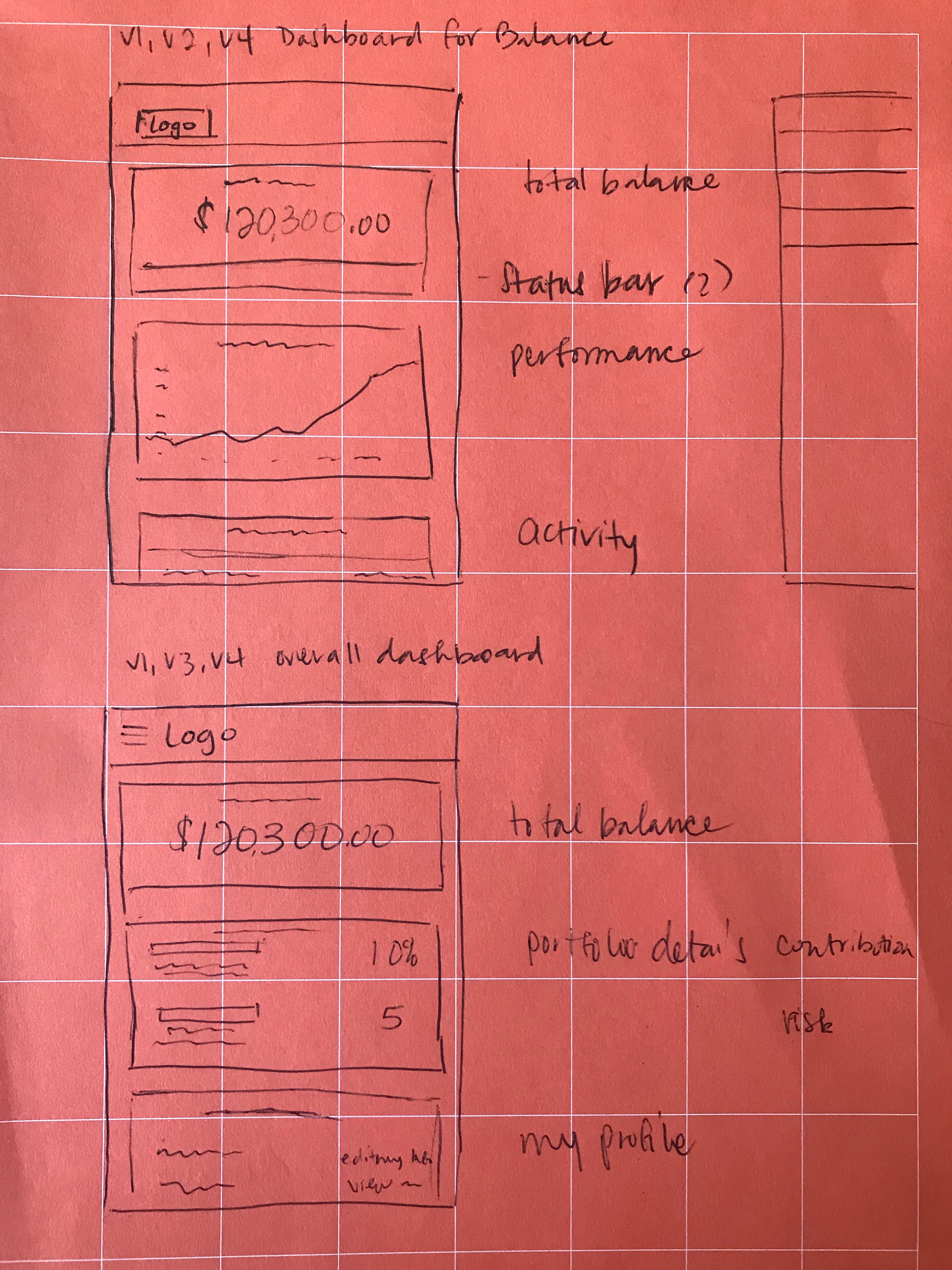
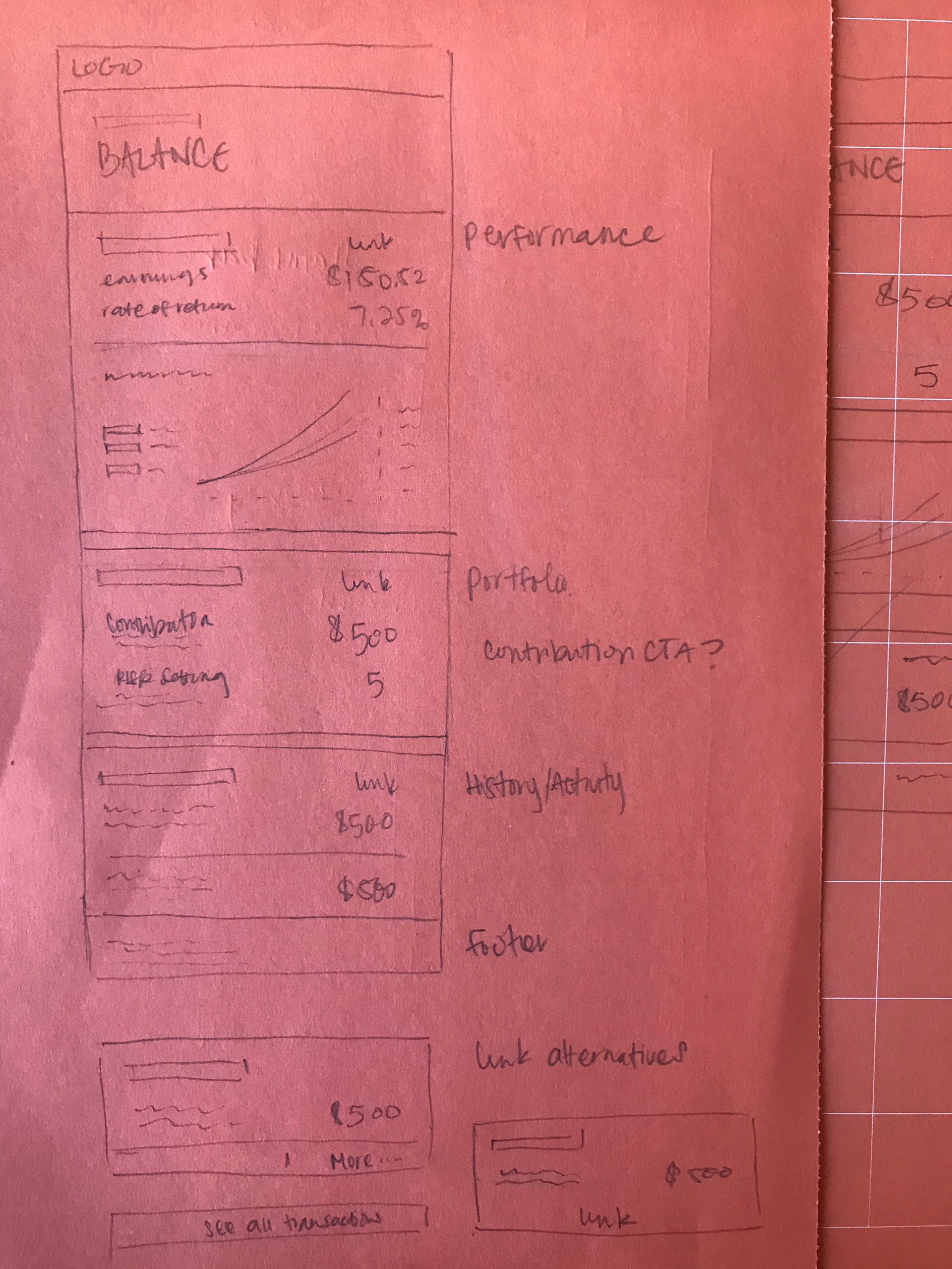
Wireframes and Tradeoffs: I developed the sketches further while exploring tradeoffs.
The left dashboard displays a more commonly used graph to communicate a 401(k)'s performance. The right dashboard displays the same performance in a card version for users that may have issues with graph literacy.

Low-fi User Testing: we tested the wireframes with 10 users mainly resulting in positive validation around our new visualizations and overall information architecture.
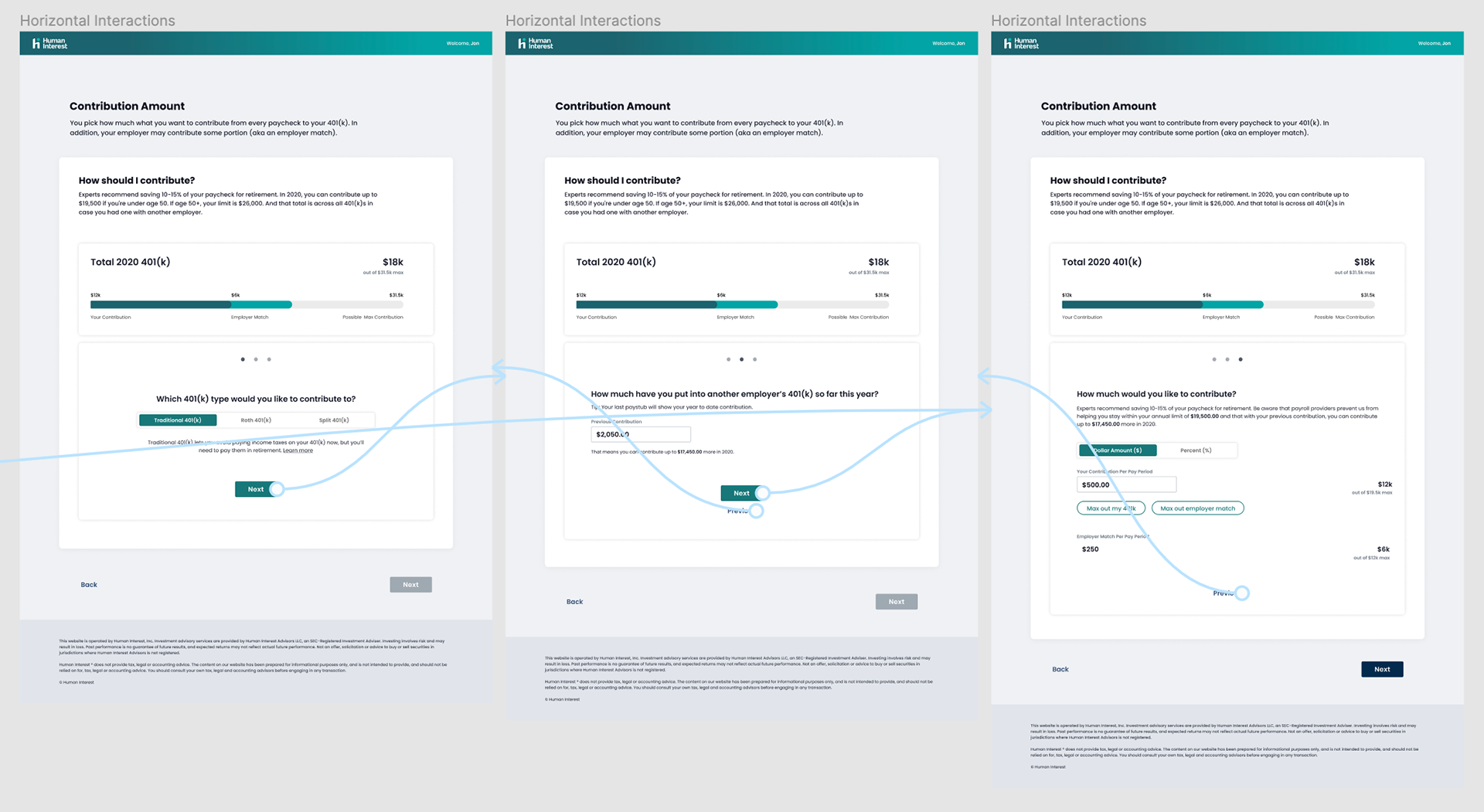
High Fi Explorations and User Testing: I continued exploring interactions despite the positive feedback to ensure the designs aligned with the onboarding experience. Below is an exloration example.
I also worked with the visual designer to understand how the UI should look under the rebrand, applied my insight across the platform and retested with 5 users.
Outcome
The data regarding the redesign's effect on 401(k) contributions will be collected in Q4 of 2021.