Overview
Datastory is a data journalism platform with interactive data visualizations for the public to access information concerning Sweden.
View live site at https://datastory.se/
Time Frame: 2 weeks
Team: Datastory Founder, 1 Developer, 1 Lead UX Designer, 1 Marketer, 1 Data Analyst, 1 Illustrator and 1 User Researcher
My Main Role: User Researcher Tools: Screenflow and Notion
Problem
Does our platform optimally support our interactive data visualizations? Do our users understand the stories conveyed in our concepts and visualizations? Do they understand how to interact with them?
Solution
I initiated and conducted 11 guerrilla user tests to avoid assumptions made on behalf of the users. I communicated the findings to the team via Notion and proposed solutions.
Two examples of the findings are listed below.
Most Reoccurring Findings
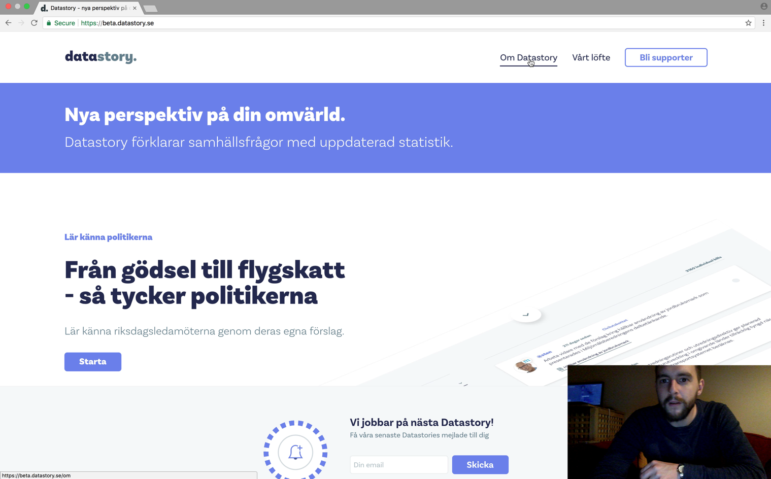
Finding: Users had difficulty locating the main content (the interactive data visualizations) of the platform. Users initially clicked on the About page instead of exploring the landing page and didn't realize they had to return to the landing page for the main content.
Proposed Solution: Include a Story page in the header where the main data visualizations/stories can easily be found and accessed when on another page.

User, Jacob, went directly to the About page instead of exploring the Home page where the main content of the platform lies and later, couldn't find the main content.
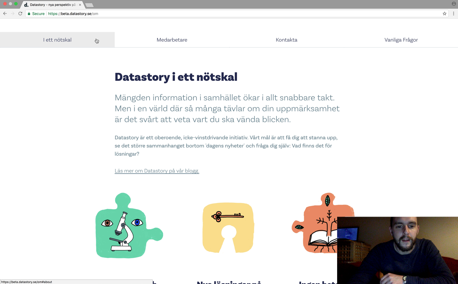
Finding: Users encountered an unexpected function with the tabbed navigation. Once a tabbed was clicked, the screen scrolled down to other content. User expected the information below to slide horizontally to new information.
Proposed Solution: The tabbed navigation should either be removed or the content underneath it should slide horizontally. Meeting user expectations can help reduce cognitive strain and improve the user experience so I proposed the following solution.

Jacob scrolled to the tabbed navigation and clicked on a tab, but the screen stayed the same. He expressed confusion and began to click on the other tabs to understand the function.
Learnings
• Simultaneously testing in English and Swedish can cause extra cognitive strain on users.